Juizy Slideshowの使い方
- 下記ページの「Download」よりファイル1式をダウンロード。
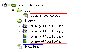
- ダウンロードしたファイルを任意の場所にコピー。
- 動作させるファイル(サンプルではindex.html)にコードを記述。
<パスは上記ファイル構成の場合なので環境にあわせて変更>
・head部分にcssファイルを読み込ませるためのコードを記述。<head> <!--css部分を抜粋して作成したcssファイル--> <link rel="stylesheet" type="text/css" href="css/Juizy Slideshow.css" /> </head>
サンプルのcssコード(サンプルのcssは改変しています)
/*ページ設定部分(style.cssなどで設定していれば削除する)*/ body, ul, li, h1, h2, span { margin: 0; padding: 0; } body { font: 75% Verdana, Arial; color: #333; background: #ddd } #container { width: 800px; margin: 50px auto; } /*ここまでページ設定部分*/ /*ここからJuizy Slideshowの設定*/ figure { display: inline-block; } #slideshow { position: relative; width: 640px; height: 310px; padding: 15px; border: 1px solid #ddd; margin: 0 auto 2em; background: #FFF; background: -webkit-linear-gradient(#FFF, #FFF 20%, #EEE 80%, #DDD); background: -moz-linear-gradient(#FFF, #FFF 20%, #EEE 80%, #DDD); background: -ms-linear-gradient(#FFF, #FFF 20%, #EEE 80%, #DDD); background: -o-linear-gradient(#FFF, #FFF 20%, #EEE 80%, #DDD); background: linear-gradient(#FFF, #FFF 20%, #EEE 80%, #DDD); -webkit-border-radius: 2px 2px 2px 2px; -moz-border-radius: 2px 2px 2px 2px; border-radius: 2px 2px 2px 2px; -webkit-box-shadow: 0 0 3px rgba(0,0,0, 0.2); -moz-box-shadow: 0 0 3px rgba(0,0,0, 0.2); box-shadow: 0 0 3px rgba(0,0,0, 0.2); } /* avanced box-shadow : http://www.creativejuiz.fr/blog/les-tutoriels/ombre-avancees-avec-css3-et-box-shadow */ #slideshow:before, #slideshow:after { position: absolute; display: block; bottom: 16px; width: 50%; height: 20px; content: " "; background: rgba(0,0,0,0.1); -webkit-border-radius: 50%; -moz-border-radius: 50%; border-radius: 50%; -webkit-box-shadow: 0 0 3px rgba(0,0,0, 0.4), 0 20px 10px rgba(0,0,0, 0.7); -moz-box-shadow: 0 0 3px rgba(0,0,0, 0.4), 0 20px 10px rgba(0,0,0, 0.7); box-shadow: 0 0 3px rgba(0,0,0, 0.4), 0 20px 10px rgba(0,0,0, 0.7); z-index: -10; } #slideshow:before { left: 0; -webkit-transform: rotate(-4deg); -moz-transform: rotate(-4deg); -ms-transform: rotate(-4deg); -o-transform: rotate(-4deg); } #slideshow:after { right: 0; -webkit-transform: rotate(4deg); -moz-transform: rotate(4deg); -ms-transform: rotate(4deg); -o-transform: rotate(4deg); } #slideshow .commands { position: absolute; top: 45%; padding: 5px 13px; border-bottom: 0; font-family: 'Amaranth', Arial, Verdana, sans-serif; font-size: 1.3em; color: #aaa; text-decoration: none; background-color: #eee; background-image: -webkit-linear-gradient(#fff, #ddd); background-image: -moz-linear-gradient(#fff, #ddd); background-image: -ms-linear-gradient(#fff, #ddd); background-image: -o-linear-gradient(#fff, #ddd); background-image: linear-gradient(#fff, #ddd); text-shadow: 0 0 1px #aaa; -webkit-border-radius: 50%; -moz-border-radius: 50%; border-radius: 50%; -webkit-box-shadow: 1px 1px 2px rgba(0,0,0,0.2); -moz-box-shadow: 1px 1px 2px rgba(0,0,0,0.2); box-shadow: 1px 1px 2px rgba(0,0,0,0.2); } #slideshow .commands:after { position: absolute; bottom: 65px; left: -18px; content: attr(title); width: 50px; padding: 12px; background: #fff; font-family: Georgia, Times, serif; font-size: 14px; text-align: center; text-shadow: 0 0 0; opacity: 0; -webkit-border-radius: 12px; -moz-border-radius: 12px; border-radius: 12px; -webkit-box-shadow: 1px 1px 4px rgba(0,0,0,0.4); -moz-box-shadow: 1px 1px 4px rgba(0,0,0,0.4); box-shadow: 1px 1px 4px rgba(0,0,0,0.4); -webkit-transition: opacity 0.7s, bottom 0.7s; -moz-transition: opacity 0.7s, bottom 0.7s; transition: opacity 0.7s, bottom 0.7s; } #slideshow .commands:before { position: absolute; bottom: 55px; left: 13px; content: " "; width: 1px; height: 1px; border-top: 10px solid #fff; border-left: 5px solid transparent; border-right: 5px solid transparent; z-index: 100; opacity: 0; -webkit-transition: opacity 0.7s, bottom 0.7s; -moz-transition: opacity 0.7s, bottom 0.7s; transition: opacity 0.7s, bottom 0.7s; } #slideshow .commands:hover:before { bottom: 35px; opacity: 1; } #slideshow .commands:hover:after { bottom: 45px; opacity: 1; } #slideshow .commands:focus { outline: 0; -webkit-transform: translate(1px, 2px); -moz-transform: translate(1px, 2px); -ms-transform: translate(1px, 2px); -o-transform: translate(1px, 2px); transform: translate(1px, 2px); } #slideshow .commands:active { -webkit-transform: translate(0, 1px); -moz-transform: translate(0, 1px); -ms-transform: translate(0, 1px); -o-transform: translate(0, 1px); transform: translate(0, 1px); } #slideshow .prev { left: -48px; } #slideshow .next { right: -48px; } #slideshow .prev, #slideshow .next { display: none; } #slideshow .prev, #slideshow .next { display: none; } #slideshow .commands1 { display: block; } /* play/pause commands */ .play_commands { position: absolute; width: 22px; height: 22px; top: 25px; right: 25px; z-index: 10; text-indent: -9999px; border: 0 none; opacity: 0; -webkit-transition: opacity 1s, right 1s; -moz-transition: opacity 1s, right 1s; transition: opacity 1s, right 1s; } .play { right: 55px; cursor: default; } .pause:hover { border: 0 none; } .play_commands:focus { outline: 0; } #slideshow:hover .pause, #sl_play:target ~ #slideshow:hover .pause, .play_commands:focus { opacity: 1; } .sl_command:target ~ #slideshow:hover .pause, #sl_pause:target ~ #slideshow:hover .pause { opacity: 0; } .pause:after, .pause:before { position: absolute; display: block; content: " "; top: 0; width: 38%; height: 22px; background: #fff; background: rgba(255,255,255,0.5); } .pause:after { right: 0; } .pause:before { left: 0; } .play { width: 1px; height: 1px; border-top: 10px solid transparent; border-left: 20px solid #fff; border-left: 20px solid rgba(255,255,255,0.5); border-bottom: 10px solid transparent; opacity: 0; } .play:hover, .play:focus { border-bottom: 10px solid transparent; } #slideshow .container { position: relative; width: 640px; height: 310px; overflow: hidden; } /* timeline base */ #slideshow .container:after { position: absolute; bottom: 0; left: 0; content: " "; background: #999; width: 100%; height: 1px; } @-webkit-keyframes slider { 0%, 20%, 100% { left: 0 } 25%, 45% { left: -100% } 50%, 70% { left: -200% } 75%, 95% { left: -300% } } @-moz-keyframes slider { 0%, 20%, 100% { left: 0 } 25%, 45% { left: -100% } 50%, 70% { left: -200% } 75%, 95% { left: -300% } } @keyframes slider { 0%, 20%, 100% { left: 0 } 25%, 45% { left: -100% } 50%, 70% { left: -200% } 75%, 95% { left: -300% } } #slideshow .slider { position: absolute; left: 0; top: 0; width: 400%; height: 310px; -webkit-animation: slider 32s infinite; -moz-animation: slider 32s infinite; animation: slider 32s infinite; } .sl_i:target ~ #slideshow .slider { -webkit-transition: left 1s; -moz-transition: left 1s; transition: left 1s; } .sl_command:target ~ #slideshow .slider { -webkit-transition: opacity 1s; -moz-transition: opacity 1s; transition: opacity 1s; } #slideshow .c_slider { position: absolute; left: 0; top: 0; width: 400%; height: 310px; background: url(../images/dummy-640x310-1.jpg) 0 0 no-repeat, url(../images/dummy-640x310-2.jpg) 640px 0 no-repeat, url(../images/dummy-640x310-3.jpg) 1280px 0 no-repeat, url(../images/dummy-640x310-4.jpg) 1920px 0 no-repeat; } .sl_i:target ~ #slideshow .c_slider { -webkit-transition: background 1s; -moz-transition: background 1s; transition: background 1s; } #slideshow figure { position: relative; padding: 0; margin: 0; } @-webkit-keyframes figurer { 0%, 25%, 50%, 75%, 100% { -webkit-box-shadow: 0 0 65px rgba(0,0,0, 0) inset; box-shadow: 0 0 65px rgba(0,0,0, 0) inset; } 5%, 20%, 30%, 45%, 55%, 70%, 80%, 95% { -webkit-box-shadow: 0 0 65px rgba(0,0,0, 0.5) inset; box-shadow: 0 0 65px rgba(0,0,0, 0.5) inset; } } @-moz-keyframes figurer { 0%, 25%, 50%, 75%, 100% { -moz-box-shadow: 0 0 65px rgba(0,0,0, 0) inset; box-shadow: 0 0 65px rgba(0,0,0, 0) inset; } 5%, 20%, 30%, 45%, 55%, 70%, 80%, 95% { -moz-box-shadow: 0 0 65px rgba(0,0,0, 0.5) inset; box-shadow: 0 0 65px rgba(0,0,0, 0.5) inset; } } @keyframes figurer { 0%, 25%, 50%, 75%, 100% { -moz-box-shadow: 0 0 65px rgba(0,0,0, 0) inset; box-shadow: 0 0 65px rgba(0,0,0, 0) inset; } 5%, 20%, 30%, 45%, 55%, 70%, 80%, 95% { -moz-box-shadow: 0 0 65px rgba(0,0,0, 0.5) inset; box-shadow: 0 0 65px rgba(0,0,0, 0.5) inset; } } #slideshow figure:after { position: absolute; display: block; content: " "; top: 0; left: 0; width: 100%; height: 100%; -webkit-box-shadow: 0 0 65px rgba(0,0,0, 0.5) inset; -moz-box-shadow: 0 0 65px rgba(0,0,0, 0.5) inset; box-shadow: 0 0 65px rgba(0,0,0, 0.5) inset; -webkit-animation: figurer 32s infinite; -moz-animation: figurer 32s infinite; animation: figurer 32s infinite; } @-webkit-keyframes figcaptionner { 0%, 25%, 50%, 75%, 100% { bottom: -55px; } 5%, 20%, 30%, 45%, 55%, 70%, 80%, 95% { bottom: 5px; } } @-moz-keyframes figcaptionner { 0%, 25%, 50%, 75%, 100% { bottom: -55px; } 5%, 20%, 30%, 45%, 55%, 70%, 80%, 95% { bottom: 5px; } } @keyframes figcaptionner { 0%, 25%, 50%, 75%, 100% { bottom: -55px; } 5%, 20%, 30%, 45%, 55%, 70%, 80%, 95% { bottom: 5px; } } #slideshow figcaption { position: absolute; padding: 20px 20px; margin: 0; left: 0; right: 0; bottom: 5px; text-align: center; letter-spacing: 0.05em; word-spacing: 0.05em; font-family: Georgia, Times, serif; background: #000; background: rgba(255,255,255,0.7); border-top: 1px solid rgb(225,225,225); color: #555; text-shadow: -1px -1px 0 rgba(255,255,255,0.3); -webkit-animation: figcaptionner 32s infinite; -moz-animation: figcaptionner 32s infinite; animation: figcaptionner 32s infinite; } @-webkit-keyframes timeliner { 0%, 25%, 50%, 75%, 100% { width: 0; } 20%, 45%, 70%, 90% { width: 640px; } } @-moz-keyframes timeliner { 0%, 25%, 50%, 75%, 100% { width: 0; } 20%, 45%, 70%, 90% { width: 640px; } } @keyframes timeliner { 0%, 25%, 50%, 75%, 100% { width: 0; } 20%, 45%, 70%, 90% { width: 640px; } } #timeline { position: absolute; background: #999; bottom: 15px; left: 15px; height: 1px; background: rgb(214,98,13); background: rgba(214,98,13,.8); width: 0; -webkit-animation: timeliner 32s infinite; -moz-animation: timeliner 32s infinite; animation: timeliner 32s infinite; } /* dots styles */ .dots_commands { position: relative; top: 32px; padding: 0; margin: 0; text-align: center; } .dots_commands li { display: inline; padding: 0; margin: 0; list-style: none; } .dots_commands a { position: relative; display: inline-block; height: 8px; width: 8px; margin: 0 5px; text-indent: -9999px; background: #fff; border-bottom: 0; -webkit-border-radius: 50%; -moz-border-radius: 50%; border-radius: 50%; -webkit-box-shadow: 0 1px 2px rgba(0,0,0,0.55) inset; -moz-box-shadow: 0 1px 2px rgba(0,0,0,0.55) inset; box-shadow: 0 1px 2px rgba(0,0,0,0.55) inset; z-index: 25; } .dots_commands li + li a { z-index: 10; } @-moz-keyframes dotser { 0%, 100% { opacity: 1; left: 0; } 20% { opacity: 1; left: 0; } 22% { opacity: 0; left: 0; } 23% { opacity: 0; left: 18px; } 25% { opacity: 1; left: 18px; } 45% { opacity: 1; left: 18px; } 47% { opacity: 0; left: 18px; } 48% { opacity: 0; left: 36px; } 50% { opacity: 1; left: 36px; } 70% { opacity: 1; left: 36px; } 72% { opacity: 0; left: 36px; } 73% { opacity: 0; left: 54px; } 75% { opacity: 1; left: 54px; } 95% { opacity: 1; left: 54px; } 97% { opacity: 0; left: 54px; } 98% { opacity: 0; left: 0; } } @-webkit-keyframes dotser { 0%, 100% { opacity: 1; left: 0; } 20% { opacity: 1; left: 0; } 22% { opacity: 0; left: 0; } 23% { opacity: 0; left: 18px; } 25% { opacity: 1; left: 18px; } 45% { opacity: 1; left: 18px; } 47% { opacity: 0; left: 18px; } 48% { opacity: 0; left: 36px; } 50% { opacity: 1; left: 36px; } 70% { opacity: 1; left: 36px; } 72% { opacity: 0; left: 36px; } 73% { opacity: 0; left: 54px; } 75% { opacity: 1; left: 54px; } 95% { opacity: 1; left: 54px; } 97% { opacity: 0; left: 54px; } 98% { opacity: 0; left: 0; } } @keyframes dotser { 0%, 100% { opacity: 1; left: 0; } 20% { opacity: 1; left: 0; } 22% { opacity: 0; left: 0; } 23% { opacity: 0; left: 18px; } 25% { opacity: 1; left: 18px; } 45% { opacity: 1; left: 18px; } 47% { opacity: 0; left: 18px; } 48% { opacity: 0; left: 36px; } 50% { opacity: 1; left: 36px; } 70% { opacity: 1; left: 36px; } 72% { opacity: 0; left: 36px; } 73% { opacity: 0; left: 54px; } 75% { opacity: 1; left: 54px; } 95% { opacity: 1; left: 54px; } 97% { opacity: 0; left: 54px; } 98% { opacity: 0; left: 0; } } .dots_commands li:first-child a:after, .dots_commands li:first-child a:before { position: absolute; top: 0; left: 0; content: " "; width: 8px; height: 8px; background: #bd9b83; z-index: 20; -webkit-border-radius: 50%; -moz-border-radius: 50%; border-radius: 50%; -webkit-box-shadow: 0 1px 2px rgba(0,0,0,0.55) inset; -moz-box-shadow: 0 1px 2px rgba(0,0,0,0.55) inset; box-shadow: 0 1px 2px rgba(0,0,0,0.55) inset; } .dots_commands li:first-child a:after { -webkit-animation: dotser 32s infinite; /* webkit can't animate pseudo-element =_= :L: */ -moz-animation: dotser 32s infinite; /* thanks moz ! :D */ animation: dotser 32s infinite; } .dots_commands li:first-child a:before { display: none; } /* need a stop ! */ /* actions when target ! */ .sl_command { display: none; } .sl_command:target ~ #slideshow .slider, .sl_command:target ~ #slideshow figure:after, .sl_command:target ~ #slideshow figcaption, .sl_command:target ~ #slideshow #timeline, .sl_command:target ~ #slideshow .dots_commands li:first-child a:after { -webkit-animation-play-state: paused; -moz-animation-play-state: paused; animation-play-state: paused; } #sl_play:target ~ #slideshow .slider, #sl_play:target ~ #slideshow figure:after, #sl_play:target ~ #slideshow figcaption, #sl_play:target ~ #slideshow #timeline, #sl_play:target ~ #slideshow .dots_commands li:first-child a:after { -webkit-animation-play-state: running; -moz-animation-play-state: running; animation-play-state: running; } .sl_command:target ~ #slideshow .pause { opacity: 0; } .sl_command:target ~ #slideshow .play { opacity: 1; right: 25px; cursor: pointer; } #sl_play:target ~ #slideshow .pause { opacity: 0; } #sl_play:target ~ #slideshow .play { opacity: 0; right: 55px; cursor: default; } .sl_i:target ~ #slideshow .slider { visibility: hidden } .sl_i:target ~ #slideshow .slider figcaption { visibility: hidden } .sl_i:target ~ #slideshow .dots_commands li:first-child a:after { display: none; } .sl_i:target ~ #slideshow .dots_commands li:first-child a:before { display: block; } } #sl_i1:target ~ #slideshow .commands { display: none; } #sl_i1:target ~ #slideshow .commands1 { display: block; } #sl_i1:target ~ #slideshow .c_slider { background-position: 0 0, 640px 0, 1280px 0, 1920px 0; } #sl_i1:target ~ #slideshow .dots_commands li:first-child a:before { left: 0; } #sl_i2:target ~ #slideshow .commands { display: none; } #sl_i2:target ~ #slideshow .commands2 { display: block; } #sl_i2:target ~ #slideshow .c_slider { background-position: -640px 0, 0 0, 640px 0, 1280px 0; } #sl_i2:target ~ #slideshow .dots_commands li:first-child a:before { left: 18px; } #sl_i3:target ~ #slideshow .commands { display: none; } #sl_i3:target ~ #slideshow .commands3 { display: block; } #sl_i3:target ~ #slideshow .c_slider { background-position: -1280px 0, -640px 0, 0 0, 640px 0; } #sl_i3:target ~ #slideshow .dots_commands li:first-child a:before { left: 36px; } #sl_i4:target ~ #slideshow .commands { display: none; } #sl_i4:target ~ #slideshow .commands4 { display: block; } #sl_i4:target ~ #slideshow .c_slider { background-position: -1920px 0, -1280px 0, -640px 0, 0 0; } #sl_i4:target ~ #slideshow .dots_commands li:first-child a:before { left: 54px; }・<body></body>内にコードを記述<div id="container"> <span id="sl_play" class="sl_command"> </span> <span id="sl_pause" class="sl_command"> </span> <span id="sl_i1" class="sl_command sl_i"> </span> <span id="sl_i2" class="sl_command sl_i"> </span> <span id="sl_i3" class="sl_command sl_i"> </span> <span id="sl_i4" class="sl_command sl_i"> </span> <div id="slideshow"> <a class="commands prev commands1" href="#sl_i4" title="Go to last slide"><</a> <a class="commands next commands1" href="#sl_i2" title="Go to 2nd slide">></a> <a class="commands prev commands2" href="#sl_i1" title="Go to 1rst slide"><</a> <a class="commands next commands2" href="#sl_i3" title="Go to 3rd slide">></a> <a class="commands prev commands3" href="#sl_i2" title="Go to 2nd slide"><</a> <a class="commands next commands3" href="#sl_i4" title="Go to 4th slide">></a> <a class="commands prev commands4" href="#sl_i3" title="Go to 3rd slide"><</a> <a class="commands next commands4" href="#sl_i1" title="Go to first slide">></a> <a class="play_commands pause" href="#sl_pause" title="Maintain paused">Pause</a> <a class="play_commands play" href="#sl_play" title="Play the animation">Play</a> <div class="container"> <div class="c_slider"></div> <div class="slider"> <figure> <img src="images/dummy-640x310-1.jpg" alt="" width="640" height="310" /> <figcaption>The mirror of soul</figcaption> </figure> <!-- --> <figure> <img src="images/dummy-640x310-2.jpg" alt="" width="640" height="310" /> <figcaption>Let's cross that bridge when we come to it</figcaption> </figure> <!-- --> <figure> <img src="images/dummy-640x310-3.jpg" alt="" width="640" height="310" /> <figcaption>Sushi<em>(do)</em> time</figcaption> </figure> <!-- --> <figure> <img src="images/dummy-640x310-4.jpg" alt="" width="640" height="310" /> <figcaption>Waking Life</figcaption> </figure> </div> </div> <span id="timeline"></span> <ul class="dots_commands"> <!-- --> <li><a title="Show slide 1" href="#sl_i1">Slide 1</a></li> <!-- --> <li><a title="Show slide 2" href="#sl_i2">Slide 2</a></li> <!-- --> <li><a title="Show slide 3" href="#sl_i3">Slide 3</a></li> <!-- --> <li><a title="Show slide 4" href="#sl_i4">Slide 4</a></li> </ul> </div> </div>サンプルのhtmlコード
<!DOCTYPE HTML> <html lang="en-US"> <head> <meta charset="UTF-8"> <title>Juizy Slideshow</title> <link href='http://fonts.googleapis.com/css?family=Mr+Dafoe' rel='stylesheet' type='text/css'> <link href='http://fonts.googleapis.com/css?family=Amaranth:700' rel='stylesheet' type='text/css'> <link rel="stylesheet" type="text/css" href="css/Juizy Slideshow.css" /> </head> <body> <div id="container"> <span id="sl_play" class="sl_command"> </span> <span id="sl_pause" class="sl_command"> </span> <span id="sl_i1" class="sl_command sl_i"> </span> <span id="sl_i2" class="sl_command sl_i"> </span> <span id="sl_i3" class="sl_command sl_i"> </span> <span id="sl_i4" class="sl_command sl_i"> </span> <div id="slideshow"> <a class="commands prev commands1" href="#sl_i4" title="Go to last slide"><</a> <a class="commands next commands1" href="#sl_i2" title="Go to 2nd slide">></a> <a class="commands prev commands2" href="#sl_i1" title="Go to 1rst slide"><</a> <a class="commands next commands2" href="#sl_i3" title="Go to 3rd slide">></a> <a class="commands prev commands3" href="#sl_i2" title="Go to 2nd slide"><</a> <a class="commands next commands3" href="#sl_i4" title="Go to 4th slide">></a> <a class="commands prev commands4" href="#sl_i3" title="Go to 3rd slide"><</a> <a class="commands next commands4" href="#sl_i1" title="Go to first slide">></a> <a class="play_commands pause" href="#sl_pause" title="Maintain paused">Pause</a> <a class="play_commands play" href="#sl_play" title="Play the animation">Play</a> <div class="container"> <div class="c_slider"></div> <div class="slider"> <figure> <img src="images/dummy-640x310-1.jpg" alt="" width="640" height="310" /> <figcaption>The mirror of soul</figcaption> </figure> <!-- --> <figure> <img src="images/dummy-640x310-2.jpg" alt="" width="640" height="310" /> <figcaption>Let's cross that bridge when we come to it</figcaption> </figure> <!-- --> <figure> <img src="images/dummy-640x310-3.jpg" alt="" width="640" height="310" /> <figcaption>Sushi<em>(do)</em> time</figcaption> </figure> <!-- --> <figure> <img src="images/dummy-640x310-4.jpg" alt="" width="640" height="310" /> <figcaption>Waking Life</figcaption> </figure> </div> </div> <span id="timeline"></span> <ul class="dots_commands"> <!-- --> <li><a title="Show slide 1" href="#sl_i1">Slide 1</a></li> <!-- --> <li><a title="Show slide 2" href="#sl_i2">Slide 2</a></li> <!-- --> <li><a title="Show slide 3" href="#sl_i3">Slide 3</a></li> <!-- --> <li><a title="Show slide 4" href="#sl_i4">Slide 4</a></li> </ul> </div> </div> </body> </html> - ファイル1式をサーバーにアップロードして設置完了。